
Collection · 60 designs
Blue Abstract Wall Art for the Kitchen / Breakfast Nook
Browse Blue Abstract art by ArtzFolio, styled for the kitchen — made-to-order in any size on gallery canvas, framed fine-art prints, acoustic panels and more. Luxury décor inspired by art, handcrafted in India, shipped pan-India with GST invoice.
Featured designs
Editor’s picks in Blue Abstract
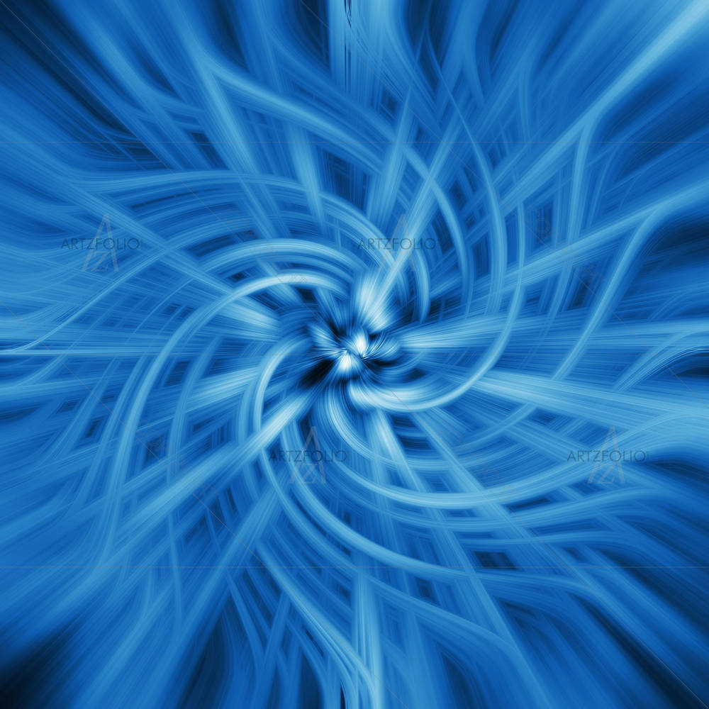
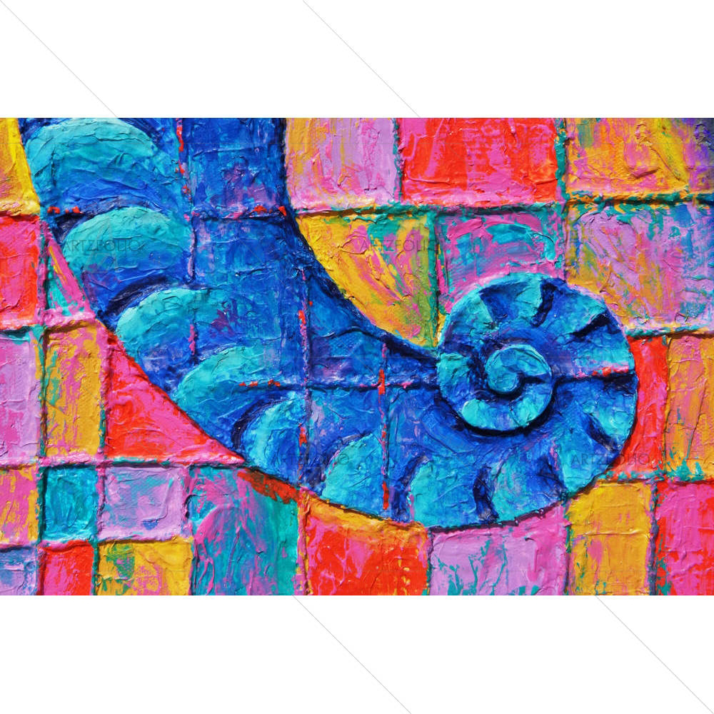
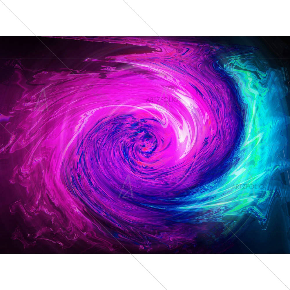
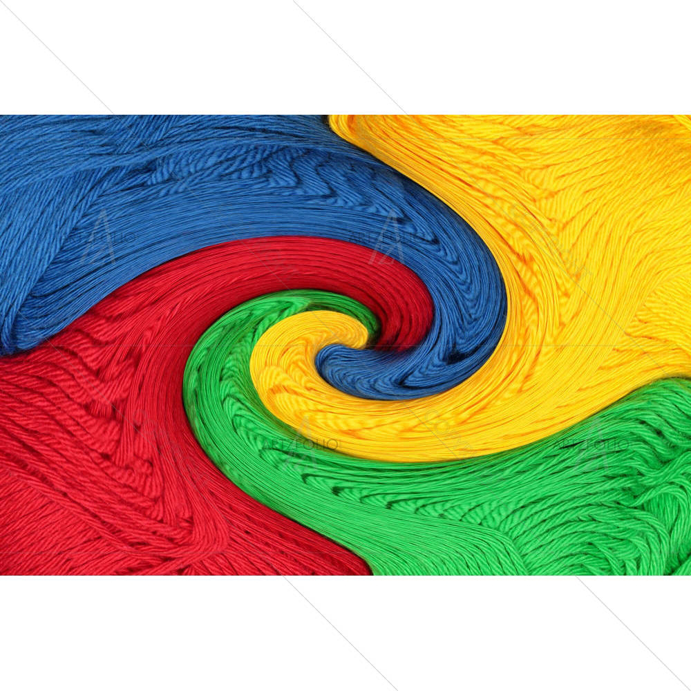
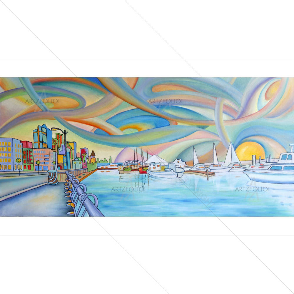
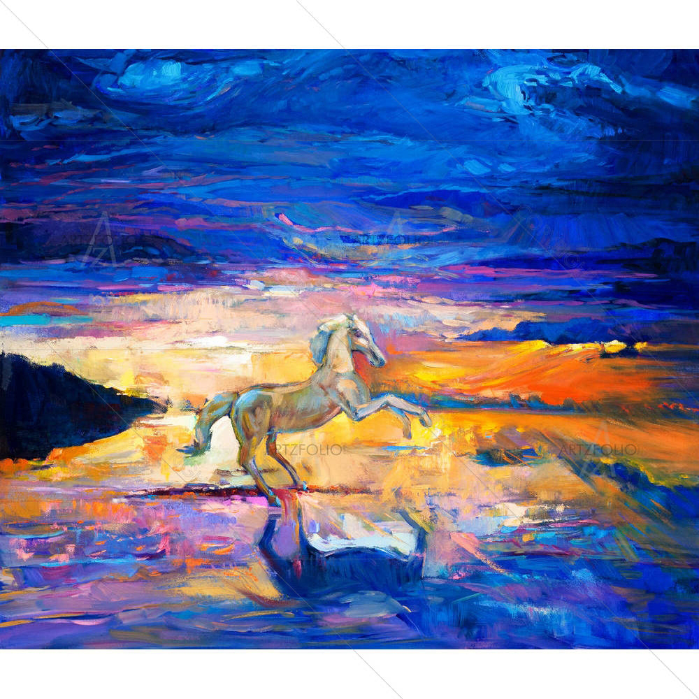
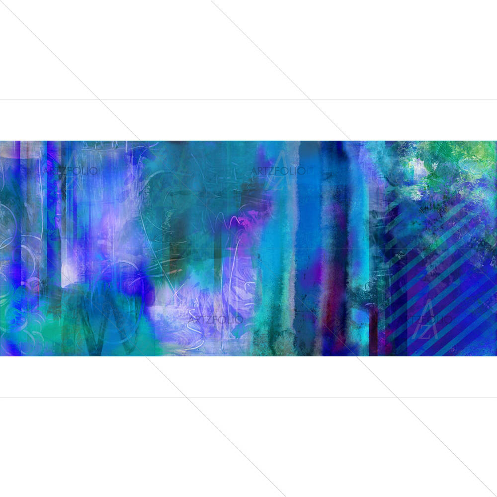
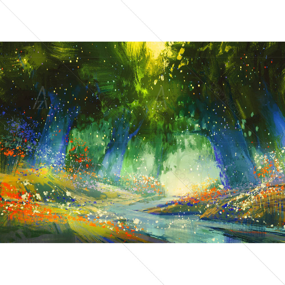
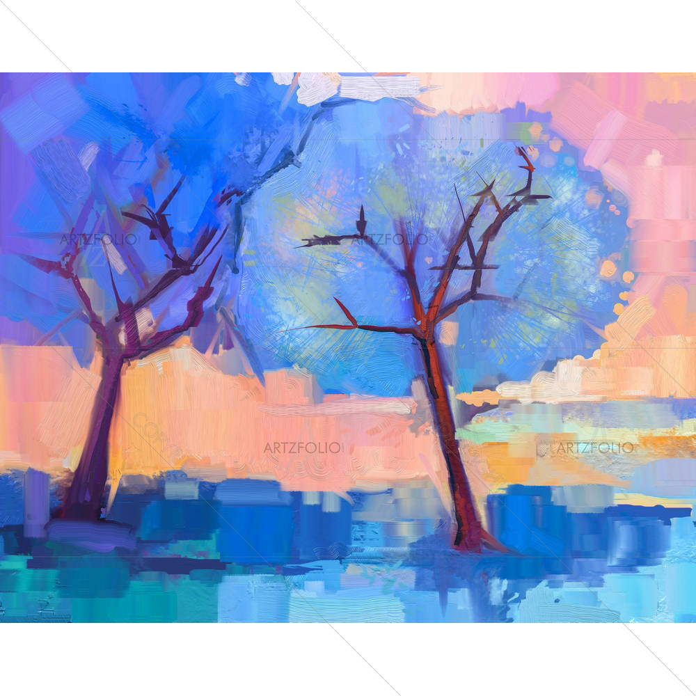
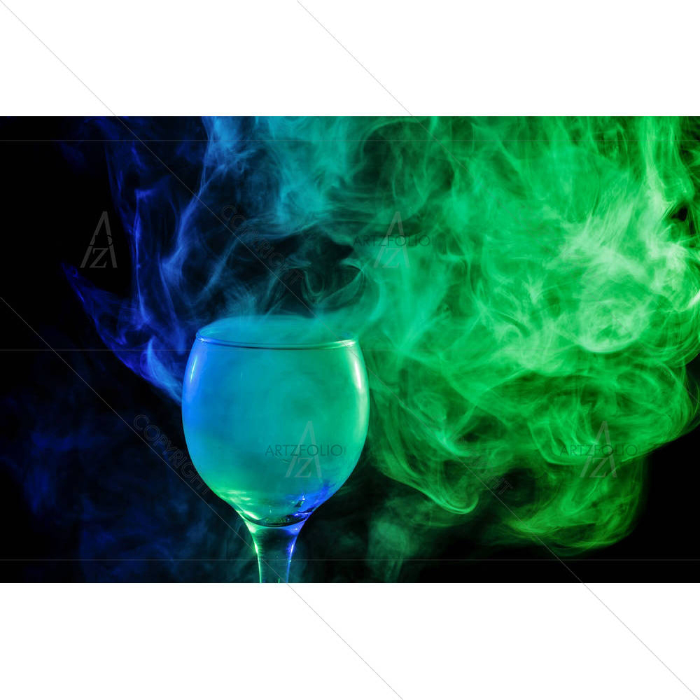
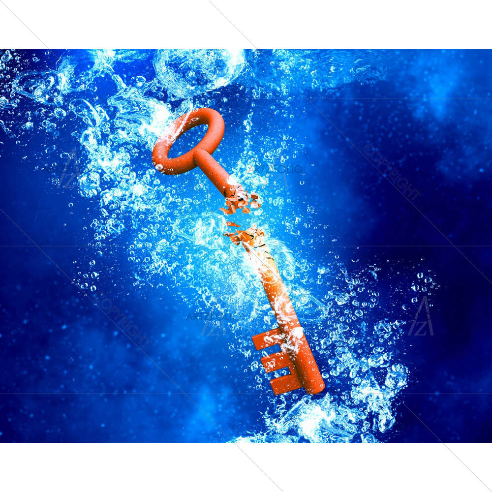
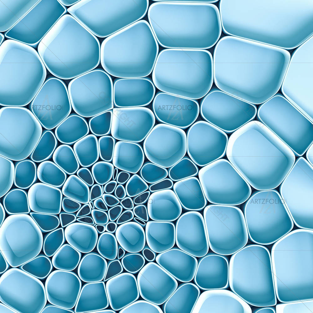
Blue SpiralOpen in Studio ↗"Blue Spiral" builds its abstract mood through blue tones set against a layered, textured surface. Where this piece earns its place on a wall is its connection to emotion and rhythm expressed without a literal subject, left open to the viewer's own reading — the kind of piece that rewards a second look rather than reading as pure decoration. On a wall, the blue palette will pick up ambient light differently through the day, so it is worth viewing the design preview at the size and wall you actually intend to hang it before finalising your order.
 Blue WhirlpoolOpen in Studio ↗
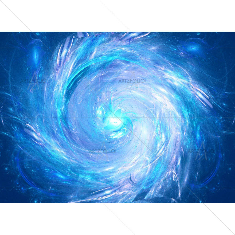
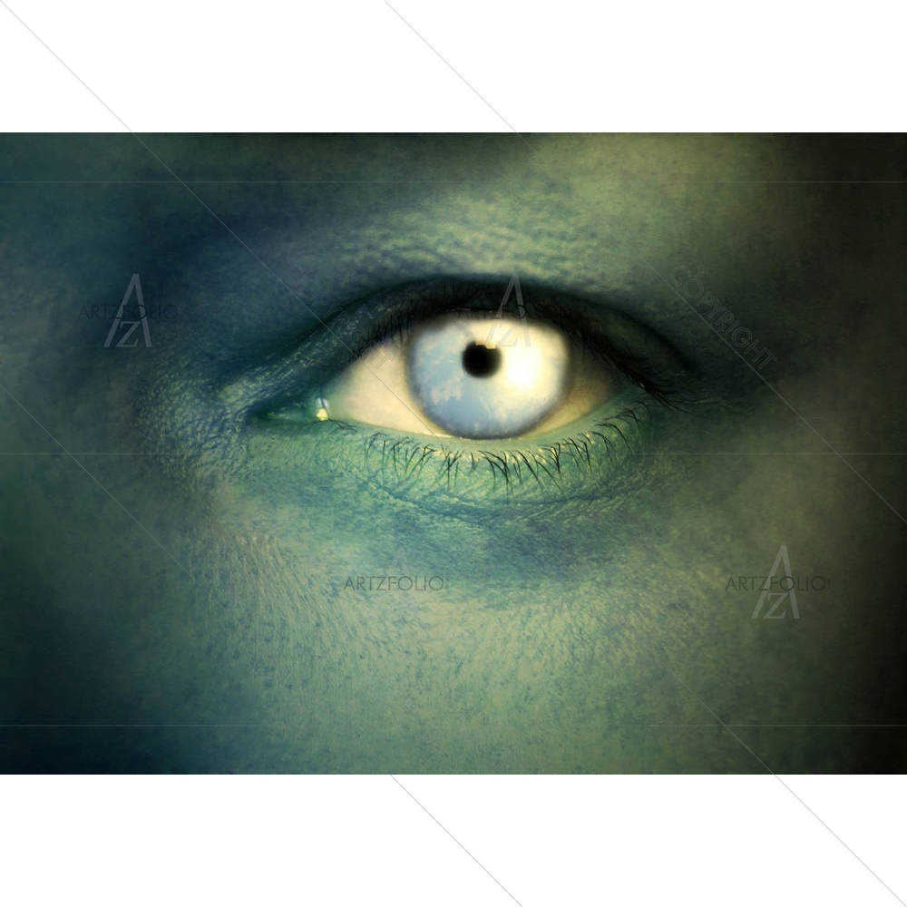
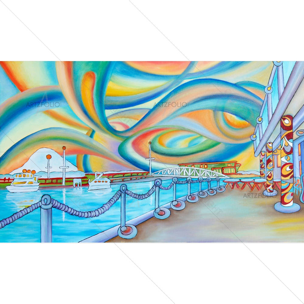
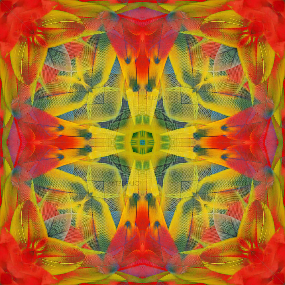
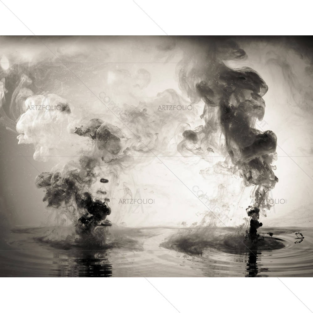
"Blue Whirlpool" builds its abstract mood through blue tones set against a rhythmic repetition of shapes. Where this piece earns its place on a wall is its connection to emotion and rhythm expressed without a literal subject, left open to the viewer's own reading — the kind of piece that rewards a second look rather than reading as pure decoration. On a wall, the blue palette will pick up ambient light differently through the day, so it is worth viewing the design preview at the size and wall you actually intend to hang it before finalising your order.
 Abstract TunnelOpen in Studio ↗
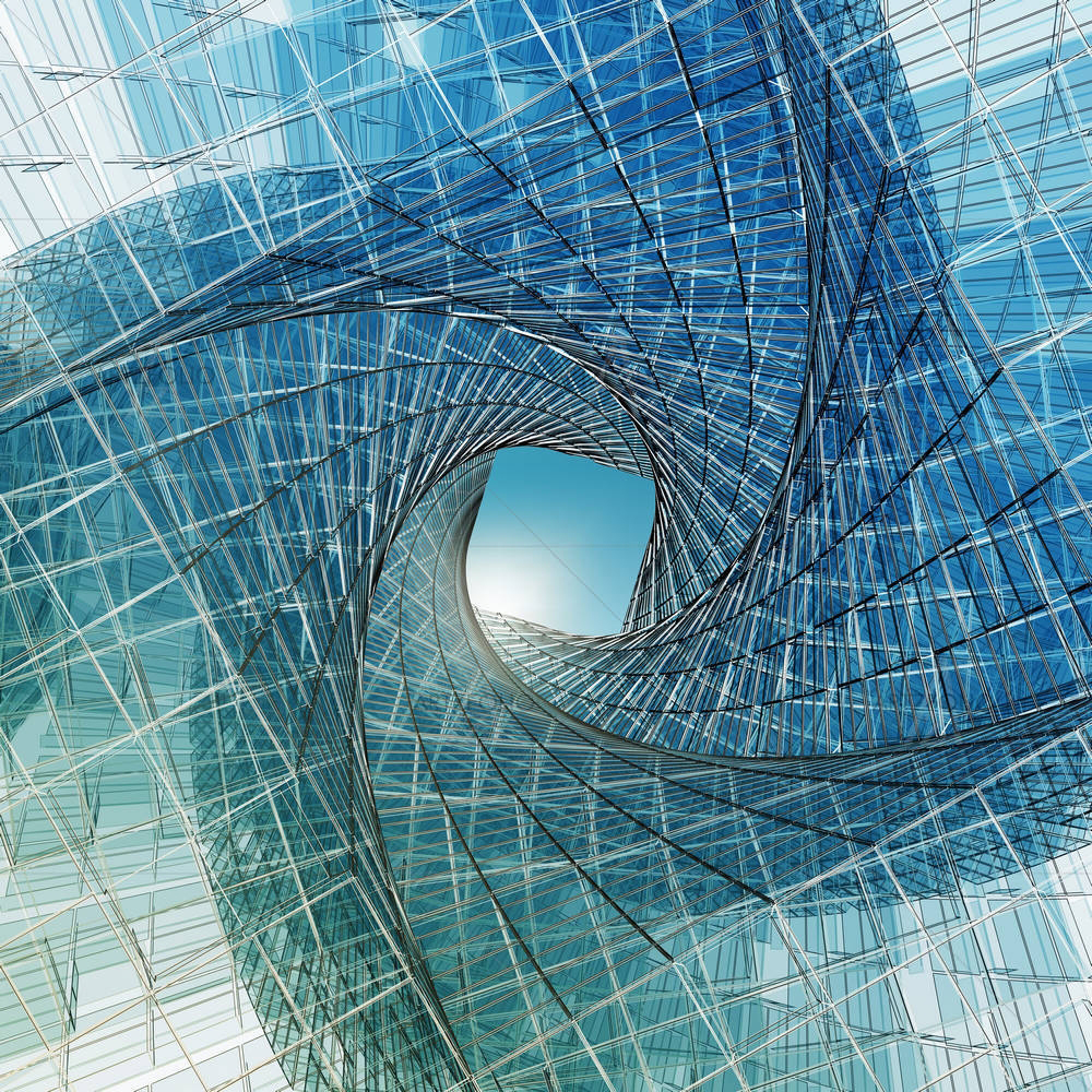
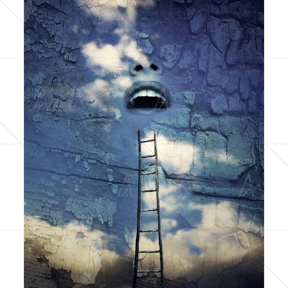
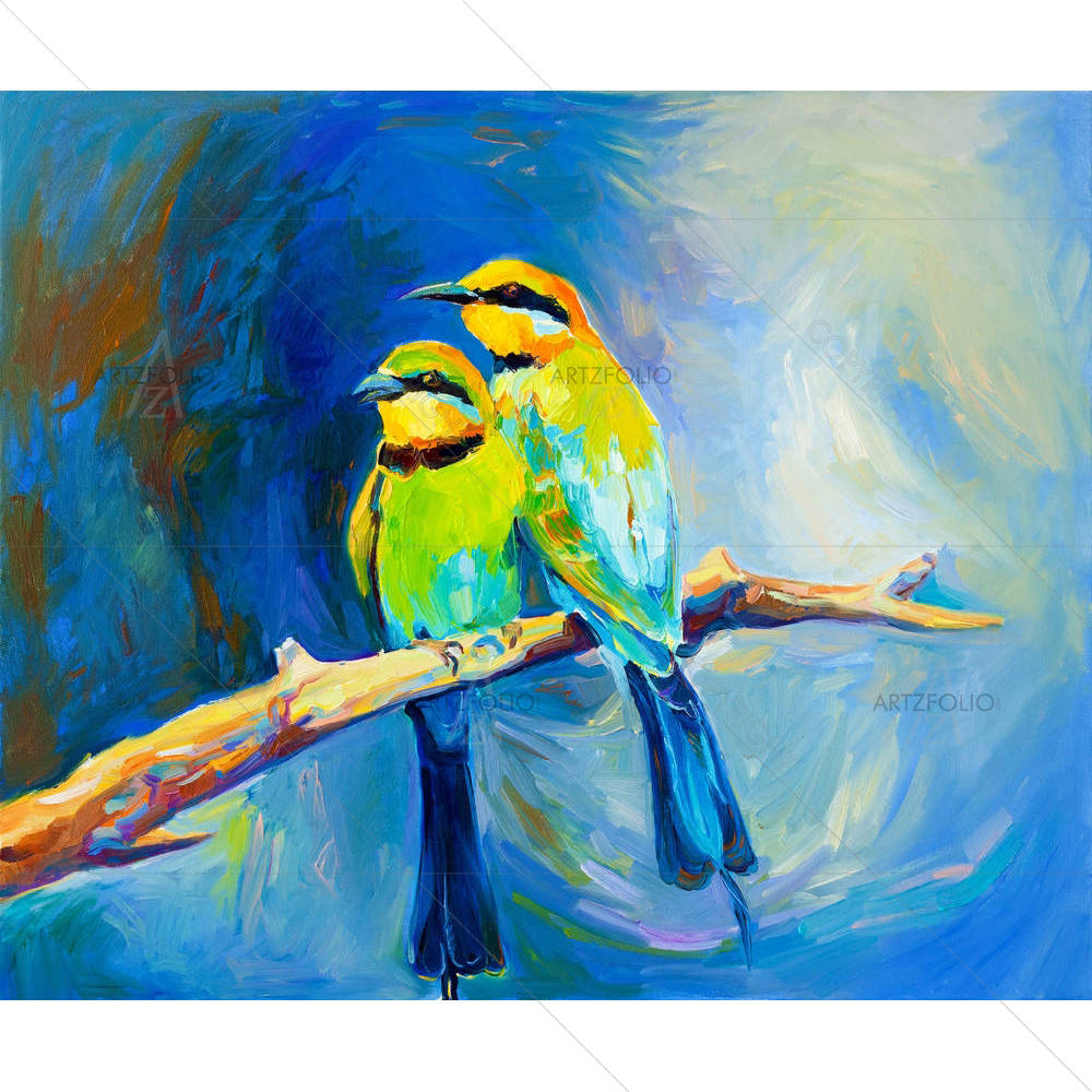
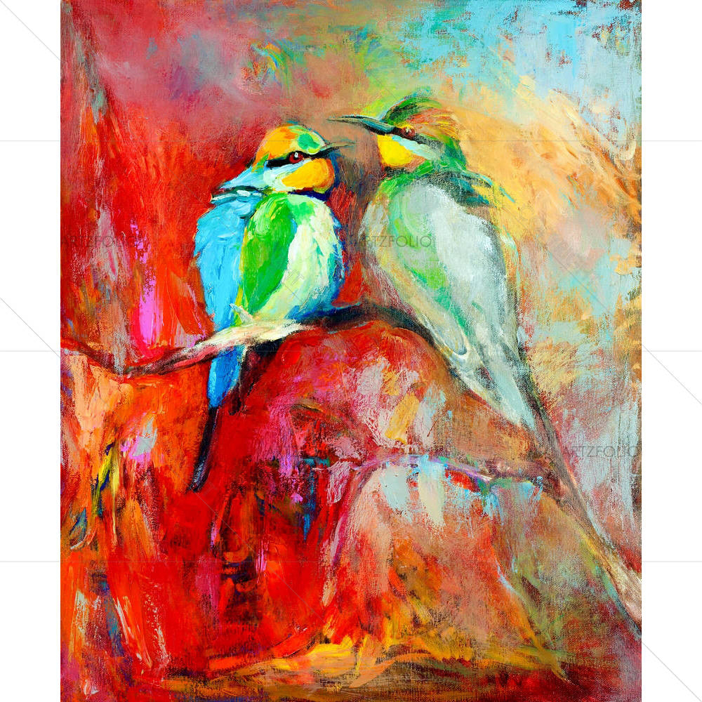
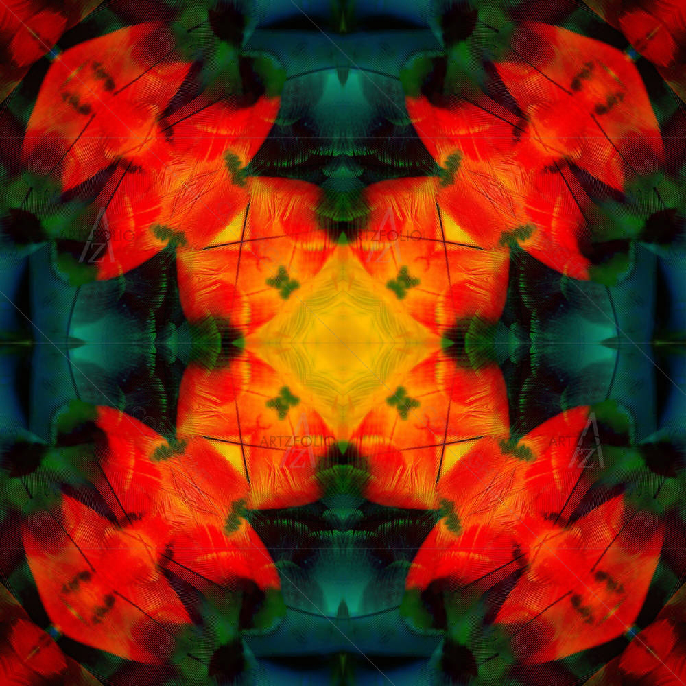
"Abstract Tunnel" builds its abstract mood through blue tones set against a dynamic, off-centre arrangement. The visual idea driving this design is its connection to emotion and rhythm expressed without a literal subject, left open to the viewer's own reading — the kind of piece that rewards a second look rather than reading as pure decoration. On a wall, the blue palette will pick up ambient light differently through the day, so it is worth viewing the design preview at the size and wall you actually intend to hang it before finalising your order.
 Blue Flowers D1Open in Studio ↗
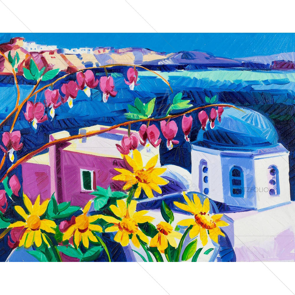
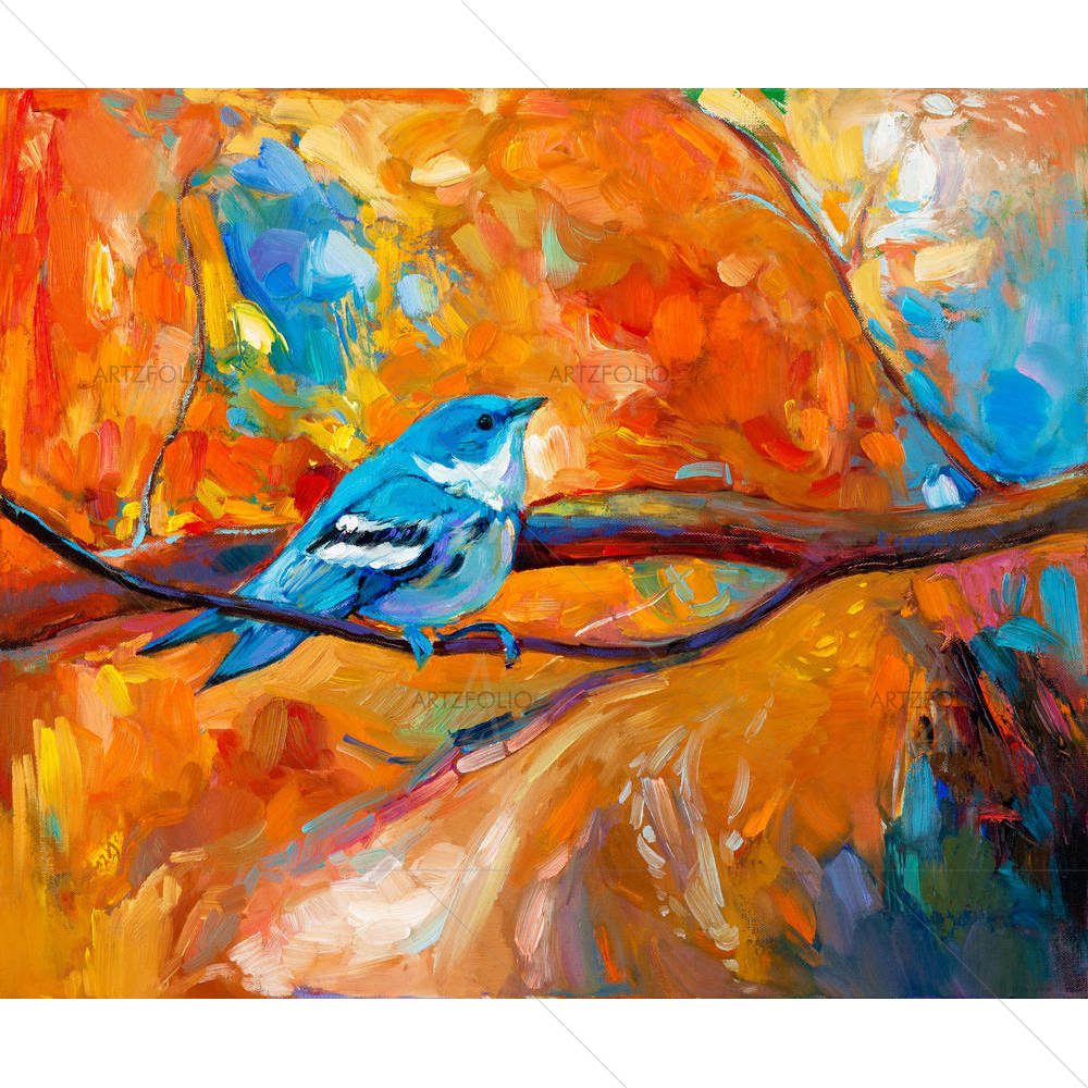
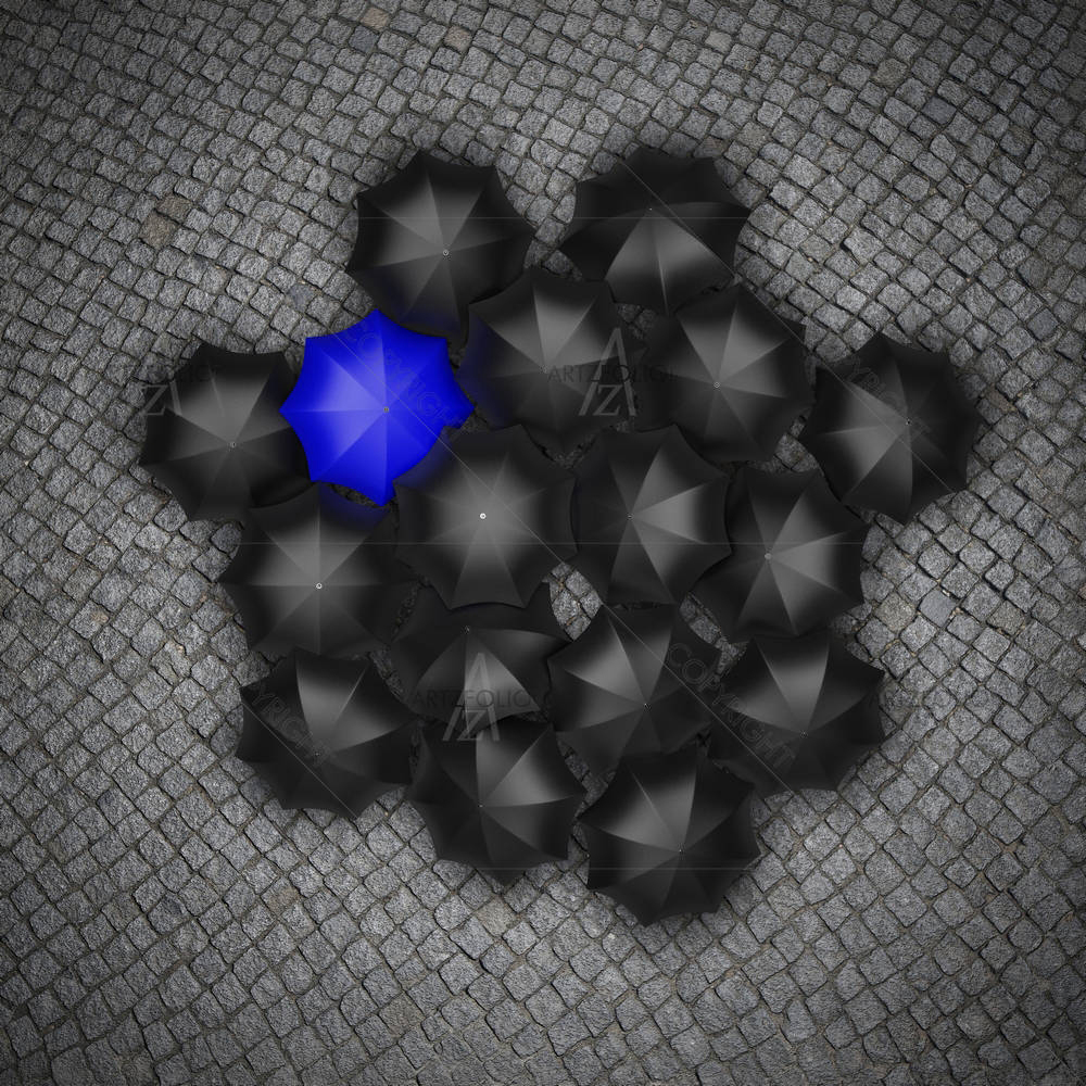
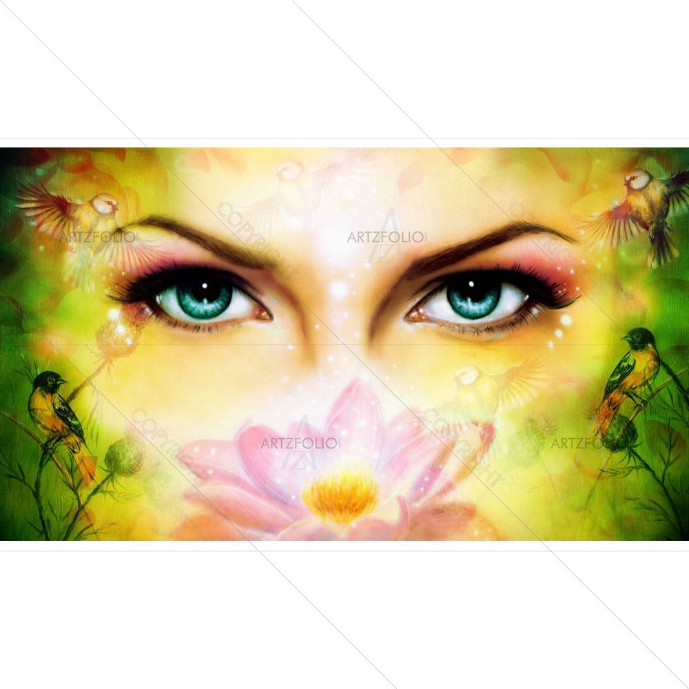
"Blue Flowers D1" builds its abstract mood through black & white, black, white, blue and earthy brown tones set against a rhythmic repetition of shapes. Where this piece earns its place on a wall is its connection to emotion and rhythm expressed without a literal subject, left open to the viewer's own reading — the kind of piece that rewards a second look rather than reading as pure decoration. On a wall, the black & white, black, white, blue and earthy brown palette will pick up ambient light differently through the day, so it is worth viewing the design preview at the size and wall you actually intend to hang it before finalising your order.
 Rainbow BurstOpen in Studio ↗
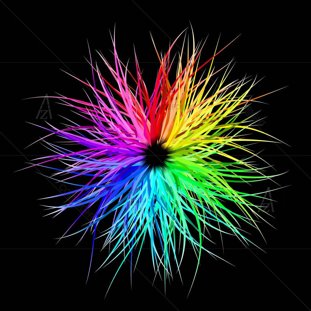
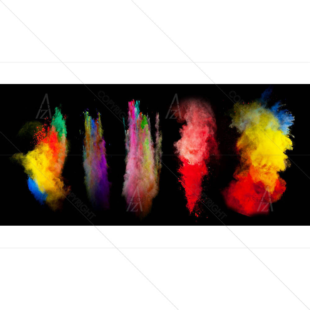
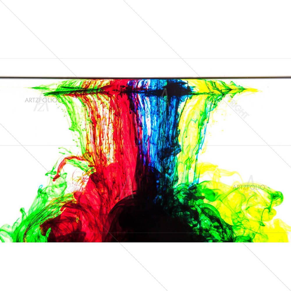
"Rainbow Burst" builds its abstract mood through blue and multicolour tones set against a dynamic, off-centre arrangement. Where this piece earns its place on a wall is its connection to emotion and rhythm expressed without a literal subject, left open to the viewer's own reading — the kind of piece that rewards a second look rather than reading as pure decoration. On a wall, the blue and multicolour palette will pick up ambient light differently through the day, so it is worth viewing the design preview at the size and wall you actually intend to hang it before finalising your order.
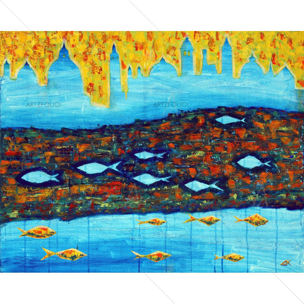 Blue Towers & FishesOpen in Studio ↗
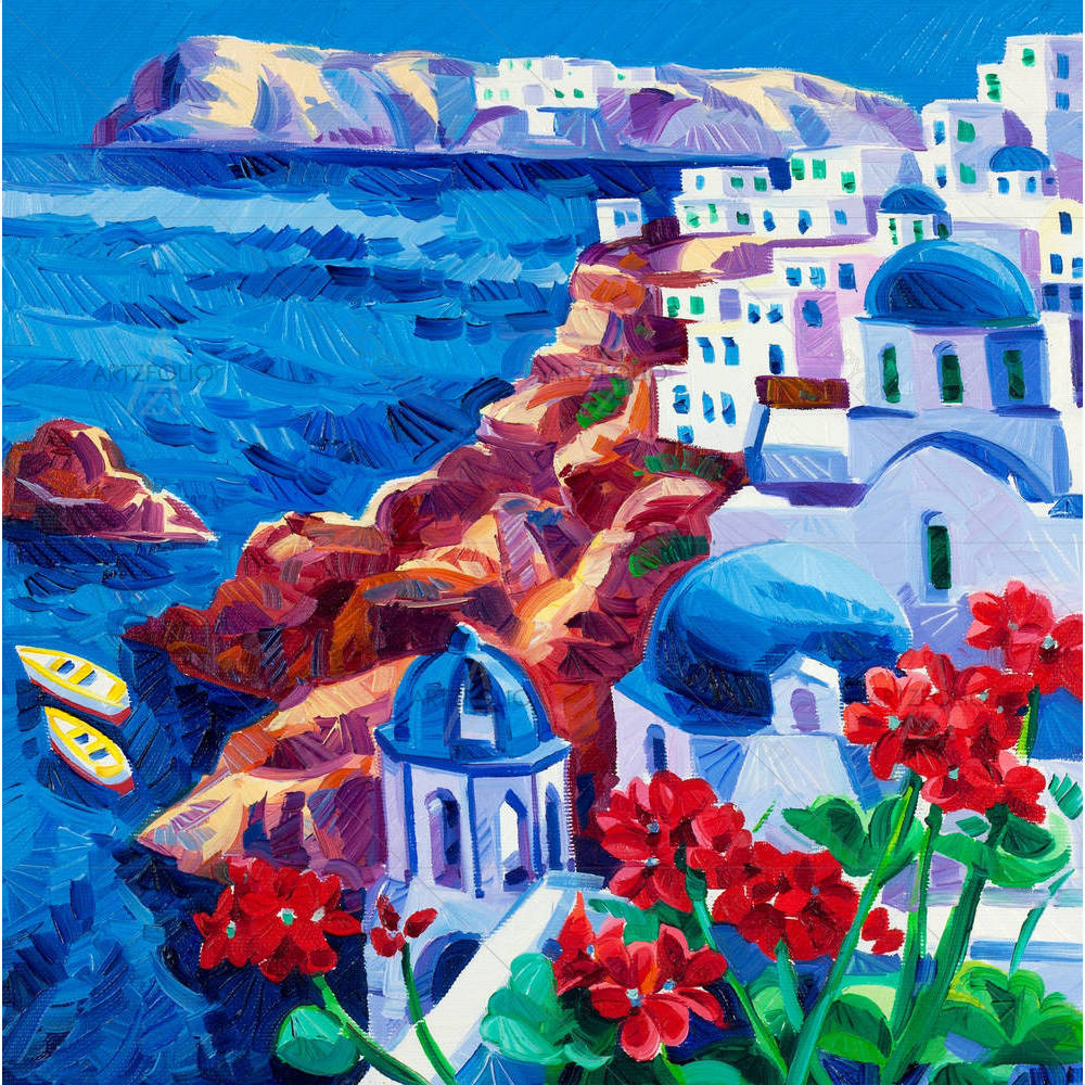
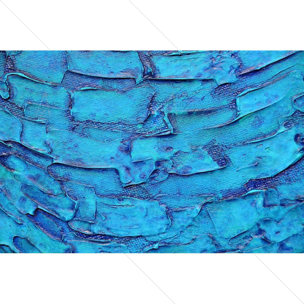
"Blue Towers & Fishes" builds its abstract mood through blue tones set against a layered, textured surface. Look closely and the real subject is its connection to emotion and rhythm expressed without a literal subject, left open to the viewer's own reading — the kind of piece that rewards a second look rather than reading as pure decoration. On a wall, the blue palette will pick up ambient light differently through the day, so it is worth viewing the design preview at the size and wall you actually intend to hang it before finalising your order.








Colour story
What colours actually run through this collection
Rather than a single flat tag, we scanned the real titles and catalogue metadata behind every design shown on this page. Blue tones dominate this set, with the palette breaking down roughly as follows — useful if you are trying to match a piece to an existing room scheme rather than starting from a blank wall.
Buying guide & encyclopedia
Blue Abstract wall art for the Kitchen / Breakfast Nook: a complete guide to choosing, sizing and styling
Blue Abstract wall art occupies a particular place in the language of interiors. It is at once decorative and expressive — a way to bring a recognisable artistic sensibility into a room while still serving the practical job of finishing a wall. At ArtzFolio, every Blue abstract piece is designed and handcrafted to order, one at a time, so the artwork is built around your wall rather than the other way round. You choose the outer dimensions to the millimetre, select the medium and frame, preview the piece in your own space, and we print, finish and deliver it across India. This guide explains what defines the abstract style, why the blue palette specifically works so well within it, and exactly how to size, frame, place and care for it so the result feels considered and permanent.
Think of this page as both a buying guide and a short encyclopedia entry. Whether you are decorating a first home, refreshing a kitchen, fitting out a study, dressing a retail or hospitality space, or specifying art for a full interior project, the principles below apply. The goal is simple: to help you choose a Blue abstract artwork that is the right size, in the right medium, framed the right way, for the room it will live in for years.
History & origins
Abstract as a category sits within a long tradition of artists and decorators returning to the same themes, motifs and ways of seeing because they continue to resonate in lived spaces. Rather than being the product of a single moment, the abstract sensibility is best understood as an evolving visual vocabulary that designers and homeowners keep reinterpreting. It carries a meaning of its own — at its core, abstract work speaks to emotion and rhythm expressed without a literal subject, left open to the viewer's own reading, which is exactly why it keeps returning across decades of interior design rather than fading as a passing trend. ArtzFolio approaches it in that spirit: drawing on the recognisable character of the style while translating it into contemporary, made-to-order pieces suited to modern Indian and global interiors.
Characteristics & visual language
What makes a piece read as abstract is a combination of subject, composition and palette working together. Understanding these traits helps you judge whether a particular artwork will sit comfortably with your existing furniture, textiles and lighting — and how much visual weight it will carry in a room.
- Subject & motif — a consistent set of themes and imagery that immediately signals the abstract character.
- Composition — the way the frame is filled: balanced and calm, or dynamic and energetic, which changes how dominant the piece feels.
- Palette — in this collection, specifically Blue, which reads as calm and contemplative, a favourite for restful spaces.
- Texture & mark — the sense of surface, brushwork or detail that gives the artwork depth on the wall.
- Scale of detail — whether the image rewards close viewing or reads best from across the room.
- Mood — the emotional register, from serene and meditative to bold and statement-making.
Choosing the right size for your wall
Size is the single decision that most affects whether art looks intentional or like an afterthought. Because every abstract piece is made to order, you are not limited to standard formats — but a few proportion rules will steer you well. For a kitchen / breakfast nook specifically, aim for kept to a smaller accent scale — this is rarely the room's largest wall feature.
- Above a sofa — aim for about two-thirds of the sofa width. For a 210 cm sofa, a single piece around 120–150 cm wide, or a pair, reads as deliberate. Leave roughly 15–25 cm between the top of the sofa and the bottom of the frame.
- Above a bed — match roughly the width of the headboard; for a queen/king, a single 100–140 cm piece or a balanced pair works well, centred on the bed rather than the wall.
- Hero / single statement wall — go large and confident; an empty wall can take a piece 120–180 cm or more on its longest side without crowding.
- Gallery cluster — combine two to five sizes around a central anchor, keeping a consistent 5–8 cm gap between frames so the group reads as one composition.
- Eye level — centre the artwork around 145–150 cm from the floor to its midpoint, the standard gallery hanging height, adjusting down slightly above low furniture.
- Narrow or vertical walls — a tall portrait-format piece flatters slim walls, stairwells and the space between windows.
Medium & finish guide
The same abstract design feels quite different across mediums. Canvas leans painterly and collectable; glazed fine-art print feels classic and crisp; acoustic panels add a quiet, functional benefit. Choose the medium for the room's purpose and light.
- Gallery canvas — framed in a real mitred moulding, gallery-wrapped, or wooden-stretch for a deeper, sculptural edge; the most painterly, collectable result.
- Framed fine-art print — archival print behind glazing with an optional single or double mount, for a refined, gallery-classic look.
- Acoustic art panel — your abstract design on a sound-absorbing panel that softens echo while it decorates — ideal for offices, studios and open-plan rooms.
- Functional surfaces — pin / notice board or magnetic writing board printed with the artwork, blending décor with everyday utility.
Colour & palette pairing
This blue edit of abstract art is calm and contemplative, a favourite for restful spaces. The most reliable way to integrate abstract art is to let its palette either echo or deliberately counterpoint the room. Pull one colour from the artwork into a cushion, rug or accessory to tie the scheme together, and let a wall in a neutral or muted tone act as a calm backdrop so the piece reads clearly. Warm-toned abstract work flatters timber, rattan and earthy interiors; cooler or more tonal palettes sit beautifully against greys, off-whites and stone. If a room is already busy, choose a quieter abstract palette; if it is restrained, a bolder piece becomes the welcome focal point.
Room-by-room styling
Each room asks something different of abstract art — scale, mood and placement should follow the way the space is used.
- Living room — make it the focal point above the sofa or console; go large and let it anchor the seating arrangement.
- Bedroom — favour calmer compositions and softer palettes above the bed for a restful mood; centre on the headboard.
- Study / home office — choose a piece with a little energy or focus behind the desk or in video-call view; acoustic panels double as sound control.
- Entryway / hallway — a tall or paired arrangement sets the tone the moment guests arrive; works well on narrow walls.
- Hospitality & retail — repeatable sizes and on-brand palettes create a coherent look across lobbies, guest rooms, cafés and cabins.
Specifically for the Kitchen / Breakfast Nook
food, beverage and warm botanical themes are the natural fit for a room built around gathering and taste In terms of scale, kept to a smaller accent scale — this is rarely the room's largest wall feature. keep prints away from direct steam or splash zones; a framed, glazed finish is easier to wipe clean than raw canvas.
Framing & matting
The frame quietly shapes how a abstract artwork is read. ArtzFolio offers six hand-finished mouldings — Black, Dark Brown, White, Natural Brown, Golden and Antique Gold — plus frameless gallery-wrap and wooden-stretch options. Black and White suit contemporary, minimal interiors; Dark Brown and Natural Brown warm up timber-rich and traditional rooms; Golden and Antique Gold add a collected, classic note that flatters richer palettes. For framed prints, a mount (mat board) gives the image room to breathe: a single mount is clean and modern, while a double mount adds depth and a more gallery-like presentation.
Care & longevity
Every abstract piece is printed with archival pigment inks chosen to hold their depth and resist fading far longer than ordinary prints, on gallery-grade canvas or fine-art cotton paper. To keep it looking its best, hang artwork out of harsh, direct sunlight and away from steam or damp; dust canvas gently with a dry, soft cloth, and clean glazing with a barely damp cloth rather than spraying liquid directly onto the surface.
Gifting, corporate & bulk orders
Blue Abstract art makes a considered gift, and because pieces are made to order you can size and frame them to suit the recipient's space. For businesses, ArtzFolio manufactures at volume under OEM and ODM for hospitality, offices, interior designers and private-label brands — with a GST invoice, no minimum order quantity for getting started, and the ability to match sizes, palettes and finishes to a brand. Explore private-label manufacturing to discuss specifications and quantities.
Made in India, delivered everywhere
Every order is crafted in ArtzFolio’s own facilities in India using 100% indigenous raw materials, dispatched in 4–7 working days with a GST invoice, secure payment and a replace-or-refund assurance. For corporate gifting, interior projects and private-label ranges we also manufacture abstract and other décor at volume under OEM and ODM — explore private-label manufacturing.
Last updated: September 2026
Questions
Blue Abstract wall art — FAQ
Can I order Blue Abstract art in a custom size?
Yes. Every Blue Abstract design is made to order — type any width and height in centimetres or inches and the price and printed area update live. There is no fixed-size restriction and no minimum order for a single piece.
What size Blue Abstract art suits a kitchen / breakfast nook?
kept to a smaller accent scale — this is rarely the room's largest wall feature.
Which medium is best for Blue Abstract wall art in a kitchen / breakfast nook?
Gallery canvas gives the most painterly, collectable result; framed fine-art print suits a classic glazed look with a single or double mount; and acoustic art panels add sound-softening to offices and studios. You can also choose magnetic or pin-board surfaces.
What frames and finishes are available?
Six hand-finished mouldings — Black, Dark Brown, White, Natural Brown, Golden and Antique Gold — plus frameless gallery-wrap and wooden-stretch options, with optional single or double matting.
Do you deliver Blue Abstract art across India?
Yes — we craft each piece to order in our own facilities in India and ship pan-India with a GST invoice, secure payment and a replace-or-refund assurance. Typical dispatch is 4–7 working days.
Do you take bulk, corporate or interior-project orders for Blue Abstract art?
Yes. For hospitality, offices, interior designers and private-label brands we manufacture Blue Abstract and other décor at volume under OEM/ODM — write to corporate@artzfolio.com or see our private-label hub.